Introduction
Orderbooks are tables that show the immediate and public supply and demand of instruments that trade on financial exchanges. They collate orders that specify the direction, price and volume at which a party wants to trade an instrument.
I have collected several months of orderbook snapshots from the perpetual XBTUSD contract on the cryptocurrency derivatives exchange BitMEX. Here I want to show some simple visualisations that give more detail into the drivers of particular changes in price that are not observable with more common candlestick charts. Orderbook charts are not however a substitute for candlestick charts, but show different information, in particular over shorter timespans.
Image visualisation for machine learning
These visualisations were motivated by the fast.ai lectures where Jeremy Howard
outlined the success previous students had found when converting strangely
shaped datasets into images to be used in more conventional image based methods.
In particular
Generating images with matplotlib
Orderbook snapshots unlike neat and tidy economic time series do not occur at regular intervals. Sometimes an orderbook may change hundreds of times a second but later in the day it may not change for minutes. The first step involved resampling the irregular snapshots to a particular frequency. In my case I choose bars that are 100ms wide (about 1/3 of the blink of an eye).
After resampling the data, I first tried using matplotlib, drawing each price level separately as a thin vertical bar. A light tan or pinkish colour represents low value while the darker purple areas represent larger volume. If you look closely you’ll see a thin white gap which is called the spread. This is the difference between the lowest price you can buy at (the offer) and the highest price you can sell at (the bid).
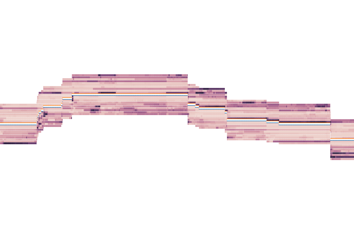
Figure 1: Sideways movement with deeper liquidity
On either side of the white gap is a blue line tracking the bid and an orange line tracking the offer. Shortly after large trades or significant events in the market, the spread widens and you’ll see the bid and offer move outward until more orders come in and the price tightens back up.
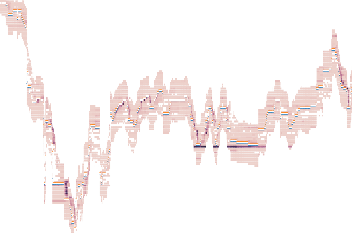
Figure 2: A particularly volatile and thin orderbook
In this case we can see a large bid inserted into the book after the price begins to settle down (shown as the dark purple/black line). Since these colours represent (in an ideal world) real demand to buy or sell the instrument, you might expect that darker colours below the white gap (large orders to buy) would lead to a net increase in the price over the near future. For example, as shown in Figure 3. However the lack of real regulation in cryptocurrency markets have led to frequent spoofing, where large orders are placed in an effort to fake supply or demand and manipulate the price, without the intention of those orders being filled.
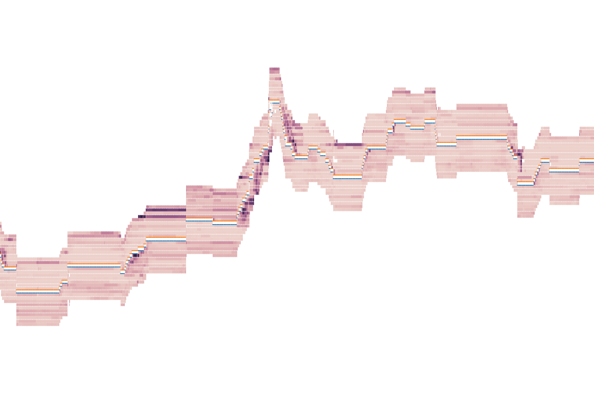
Figure 3: Price moving up in response to large bids
Drawing pixel by pixel
When using these images as input to a simple CNN, a recurring issue was the CNN would latch onto small thin lines in the matplotlib generated images. If you look closely you may be able to see them between the price levels. These strange aberrations were not meaningful, and therefore I tried a more direct method for generating the images.
I choose to generate two-channel images (one for the bids and one for the asks) and draw one pixel for each step in the resampled data. The x-coordinate equal to time and the y-coordinate equal to the volume. This led to images that look like the following.
Figure 4: More sideways movement with stronger bids
One important decision is how to compress the wide range of values for the volume at a level into an 8-bit value that can be used in an image. It’s pretty easy to argue that either \(\sqrt{x}\) or \(\log{x}\) is a sensible choice for scaling. I used \(\sqrt{x}\) in these images. This ended up leading to visually pleasing images with a punchy green for large bids and bright red for large asks.
Figure 5: Movement within a range with large bids and offers
This choice of how to normalise the volume is however crucial in being able to convey a meaningful representation of what has happened over the image. Another choices might be to adjust the colour based on a rolling average of how much has been traded recently, which would adjust for periods of high or low volatility.
While the images were saved as simple pngs with three channels, it’s safe to throw away the third channel if using it as an input to a CNN since it is totally zero.
Figure 6: Large bids inserted after a brief fall
</home/moss/org/braindump/roam/bibliography/papers.bib>